Five Acres Agency, 2023–2024
Record-breaking conference attendance, a stoked client, and a commitment for next year's conference
Research (team), Branding (team), Illustration, UX Design
Photoshop, Illustrator, XD, InDesign
Education and Progress, Kindness and Positivity
For over twenty years, the CSDC (Charter Schools Development Center) Conference has brought together charter staff and leaders across California for three days of connection, workshops, training, and advocacy. For their 2024 conference, they looked to the Five Acres team for a logo and brand identity system to tell their story, inspire learning, and leave attendees feeling energized and inspired for what's next in charter education.
The team at CSDC needed a brand identity that worked across physical and digital media, with multiple vendors, and at a variety of scales; it had to look just as good in the massive SAFE Center as it did in an email on an iPhone. Flexibility, clarity, and accessibility were key concerns, as was the client's desire to balance a sense of play and energy with the focused professionalism of the conference.
I'm a big believer in the power of public education, though charters (a type of public school, though often with different curricula) were something I didn't know as much about prior to this project. It was awesome to be able to learn more about the folks behind the scenes and work with them to build something inspiring from the ground up.
Once we had a good idea of the scope and scale of the project, I dove into brainstorming, mood boarding, logo sketching, and exploration. The two folks working with me on the project, Halleh Abedi and Juliana Tipton, are design rockstars. Our team might be smaller at Five Acres, but we're collaborative; working together, they drove my initial concepts over the finish line.
After a few rounds of ideation, we found our initial concepts looked solid, but still didn't feel uniquely tied to the conference. We went back to the drawing board, poring over our research on the venue, the host city, and sketches. One of those sketches sparked an idea, and that idea became the brand: since the conference location changes each year, we'd make what was unique about the location itself this year the conference brand.
We had big ideas for the brand, so we kept the logotype bold, simple, and highly legible to balance. Its various pieces could be remixed and rearranged depending on the use case for maximum versatility.
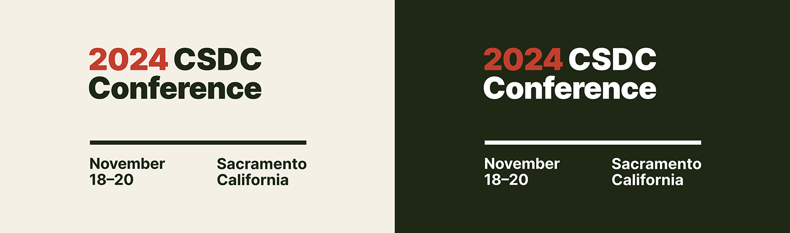
The logotype in one of its many variations. Each of its pieces can be broken out, depending on the use case.
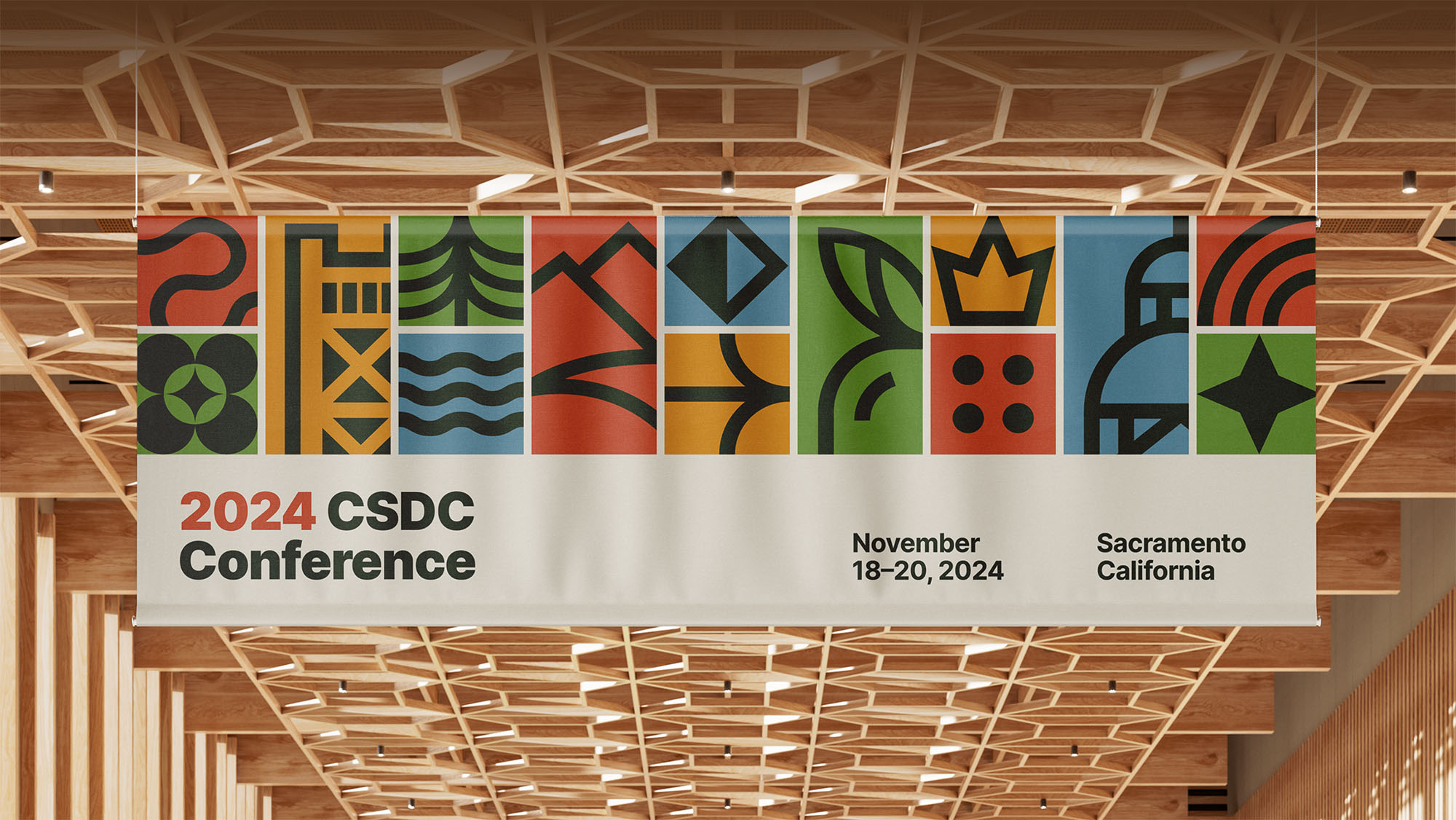
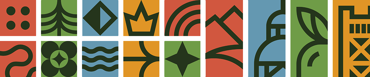
After we decided to bring Sacramento to the fore when designing the identity, the rest fell into place. We illustrated a distinctive, custom set of graphics to make up the bulk of the identity. Each features a symbol unique to Northern California, like Sacramento's Tower Bridge and the Capitol building. To make composing them easy and flexible for various applications, all of the graphics are designed to fit into a simple 2x2 tiling grid.
Even the color palette pulled from our host city, with vibrant colors like Sierra Red, Bridge Gold, and Valley Green. And to make everything as easy as possible for other designers and vendors, we wrapped it up in a comprehensive brand guidelines book.
A big part of the brand was, of course, digital: not only did the identity need to look great, but it needed to work across the slide decks used throughout the conference during presentations. And of course, there was the matter of the website—arguably the most important digital touchpoint leading up the conference itself.
While development wasn't in scope for us this time around, we took the opportunity to design an example website as a showcase of the brand in action. Again, usability and accessibility were key considerations, as was the ability of the brand to work with real-world imagery mixed in.
What resulted was a digital experience just as bright, inspired, and place-focused as the rest of the identity, with quick links for attendees to learn about the conference, speakers, and host city in greater detail before buying tickets.
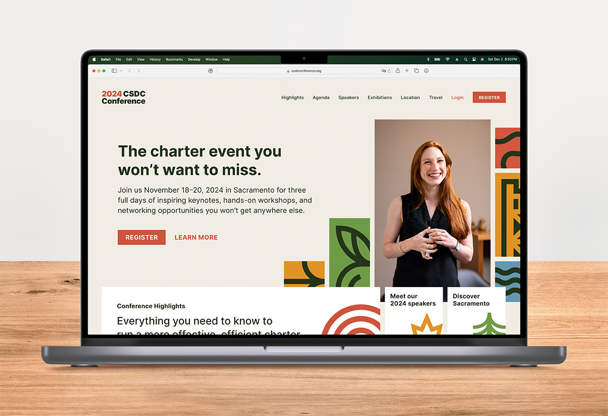
An example website showcasing the brand in use helps attendees learn more about CSDC and Sacramento, register for the event, and plan their travel.
After a thorough branding process, it was time to put it to the test in the (very real, very large) conference hall. And according to the numbers, Five Acres came through. Attendance at the 2024 CSDC Conference broke records, with attendees representing over 90% of California counties showing up for three days of learning, connecting, and growing.
Not only was the conference a success, but the client was stoked, which is always the goal. So much so, that Five Acres will be doing next year's conference branding—with an expanded scope—as well.
The 2024 conference surpassed 2023's already record-setting attendance.
From CSDC's conference recap. Read it here.
from California were represented by the 2024 CSDC Conference attendees.
From CSDC's conference recap. Read it here.
Five Acres secured an expanded design contract for next year's conference.
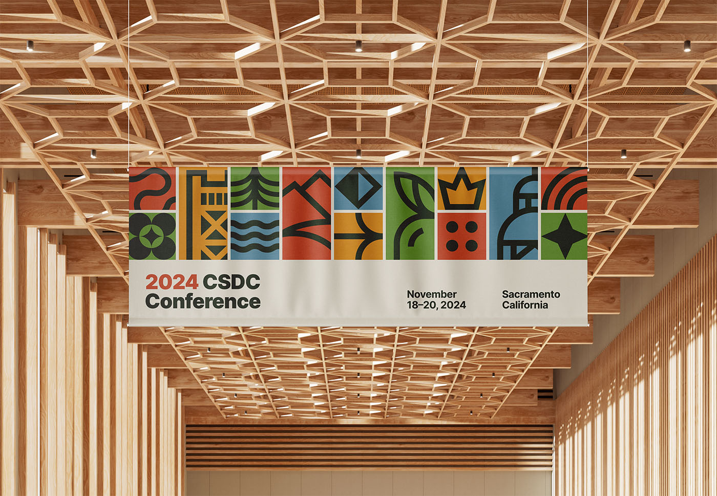
An example banner brings the identity system's bold graphics, bright colors, and simple wordmark together to provide a distinctive welcome to the CSDC 2024 Conference.
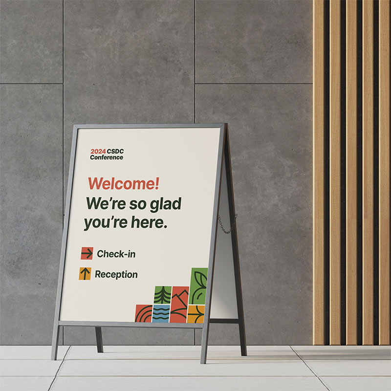
Friendly, clear signage created as an example of the brand in use guides attendees to where they need to go next and keeps the conference brand identity present throughout the massive venue.
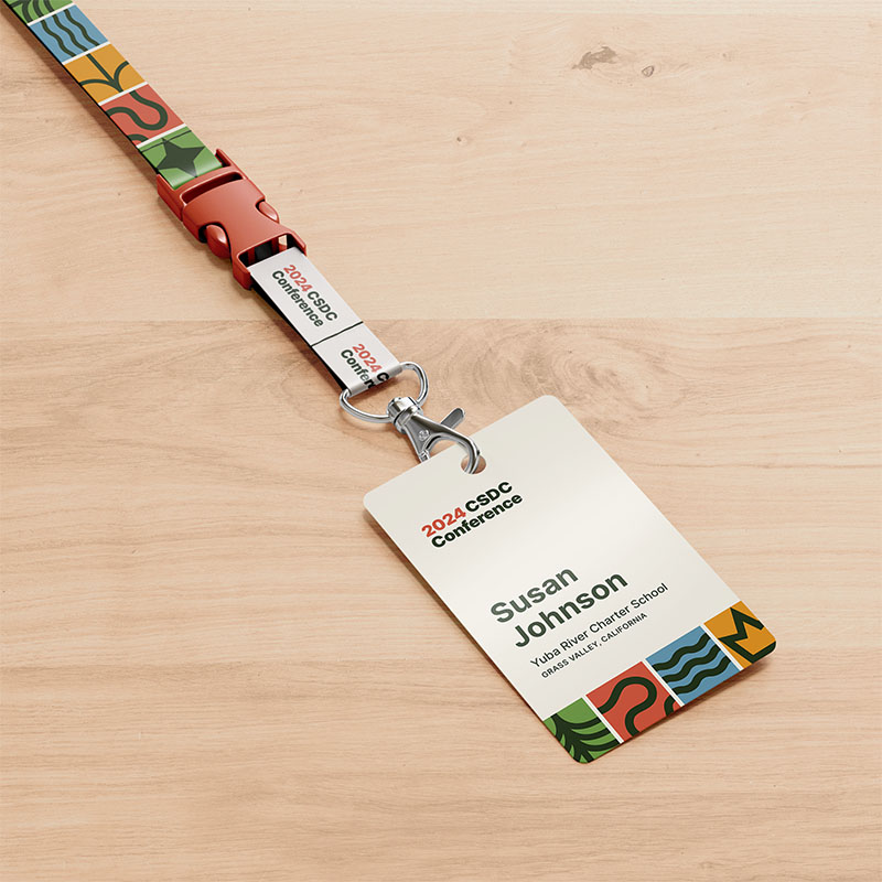
Hey there, stranger! An attendee badge and lanyard created as an example of the brand in use makes folks feel more at home and minimizes those "Great to meet you! What was your name again?" slip-ups.
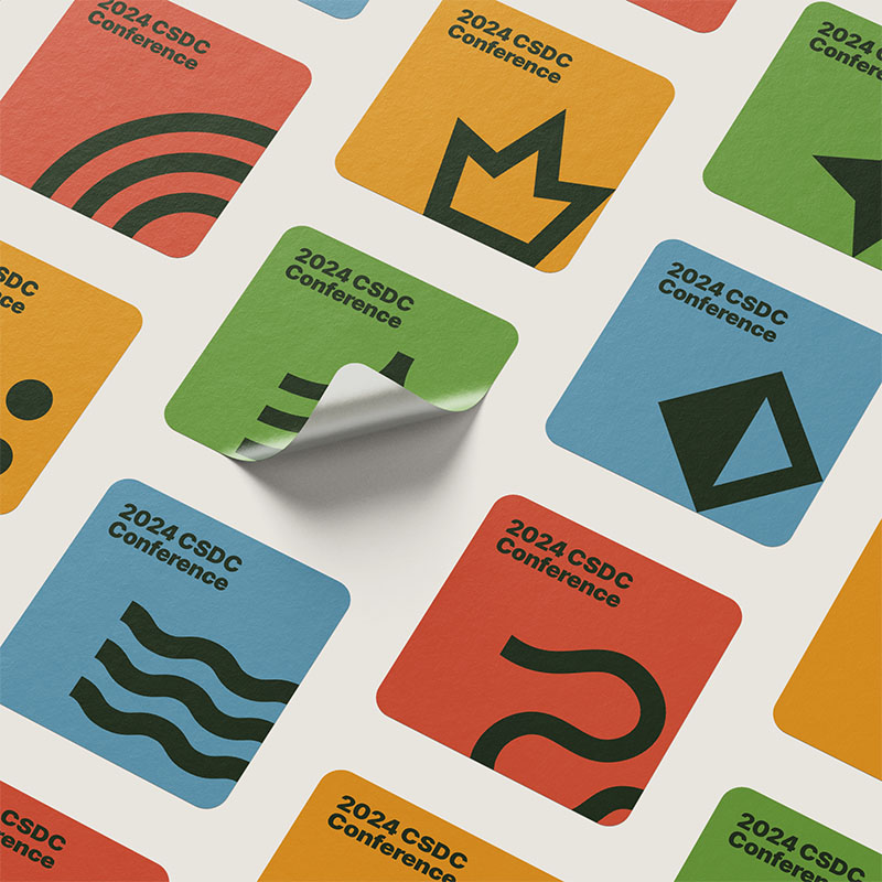
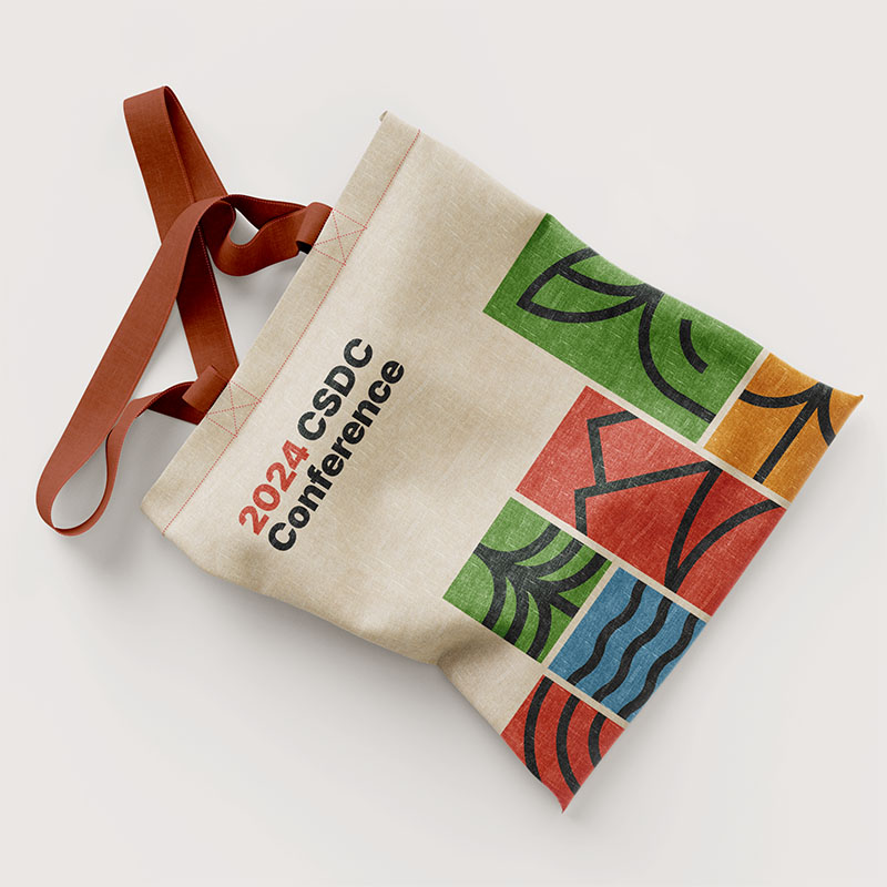
Vinyl stickers and a souvenir tote bag created as examples of the brand in use. Let's be real—conferences are Type A fun, but it's the freebies that make you feel like you're truly getting your money's worth.
This project (and all of my work while at Five Acres Agency) is a product of tight collaboration, co-ideation, and frequent team review. This project was a team project, with agency founder Halleh Abedi and senior designer Juliana Tipton brainstorming from day one, designing with me, continuously reviewing and giving feedback, and guiding it throughout. Thank you to both of you for making me a better designer and a better human. And a huge shout-out to studio manager Kimberly Bergmooser for keeping us on track and keeping the client in the loop; you're the best.
Designing an app that makes tracking winter sports faster, easier, and more useful