Coursework, 2019
A friendly information hub and a global call to action that offers resources and actionable steps to get involved
Branding, Illustration, Copy, UI, Animation
Illustrator, InDesign, XD, After Effects
Education and Progress, Kindness and Positivity
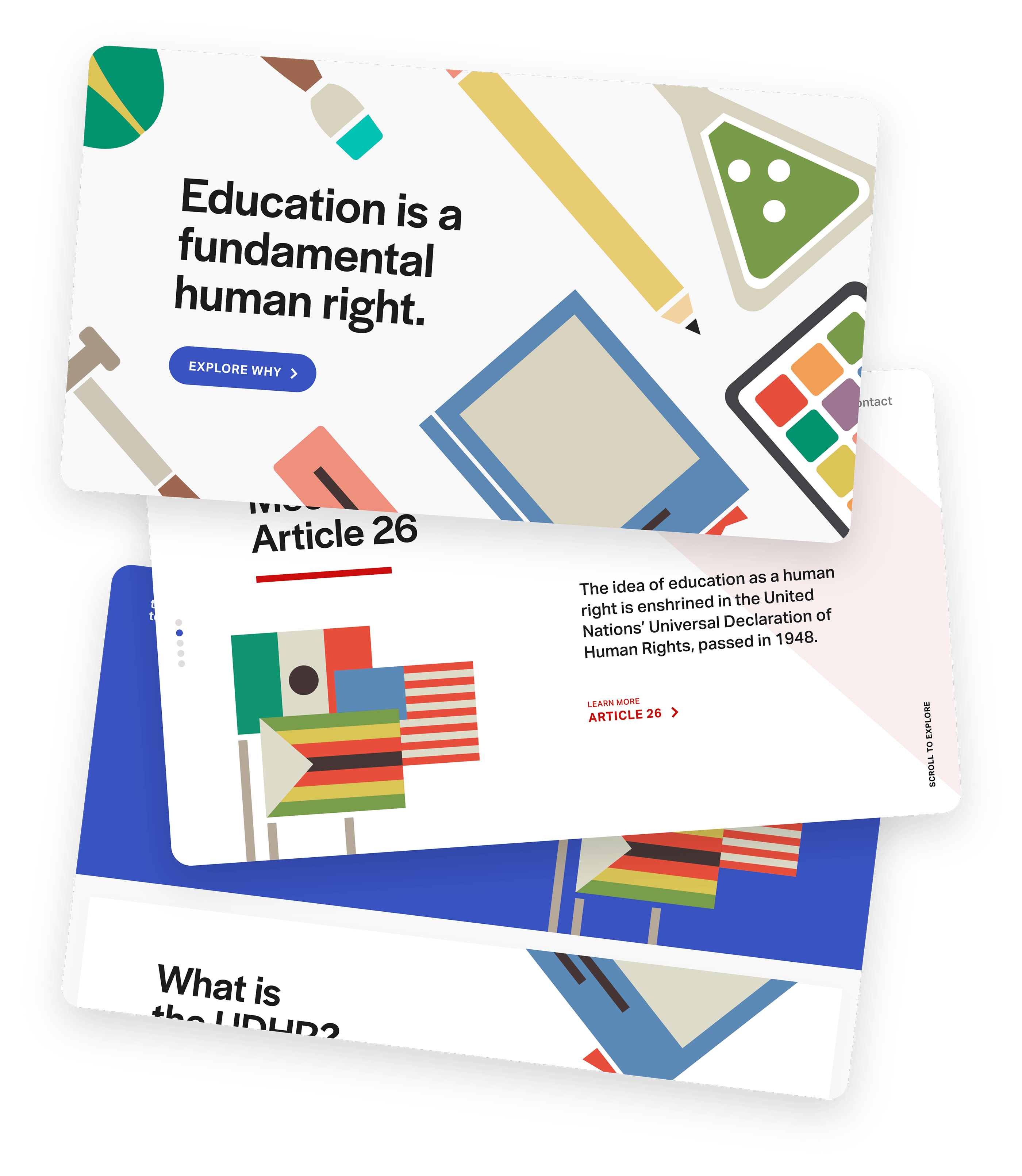
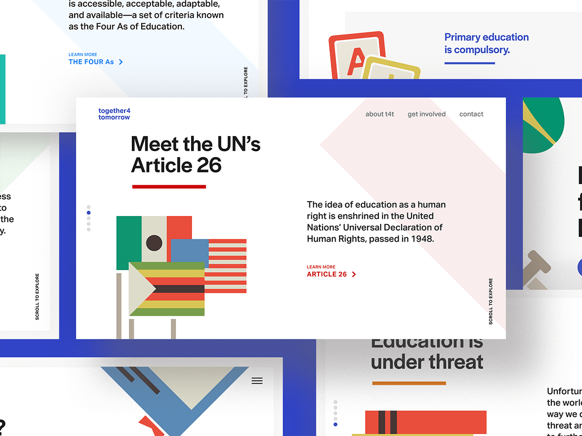
This project got its start as a campaign for the Universal Declaration of Human Rights’ Article 26, passed by the UN in 1948. In just a few short paragraphs, it outlines the foundation for everyone’s right to an education that should be made accessible, acceptable, adaptable, and available, no matter who they are or where they are in the world.
But together4tomorrow became a lot more to me once I dove into the research and started working with the material—not only is education one of my core values, it’s a fundamental tool to achieving the health, equity, and prosperity that everyone deserves.
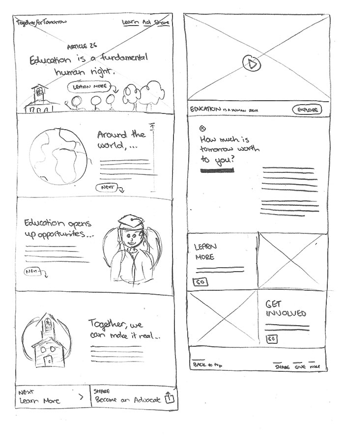
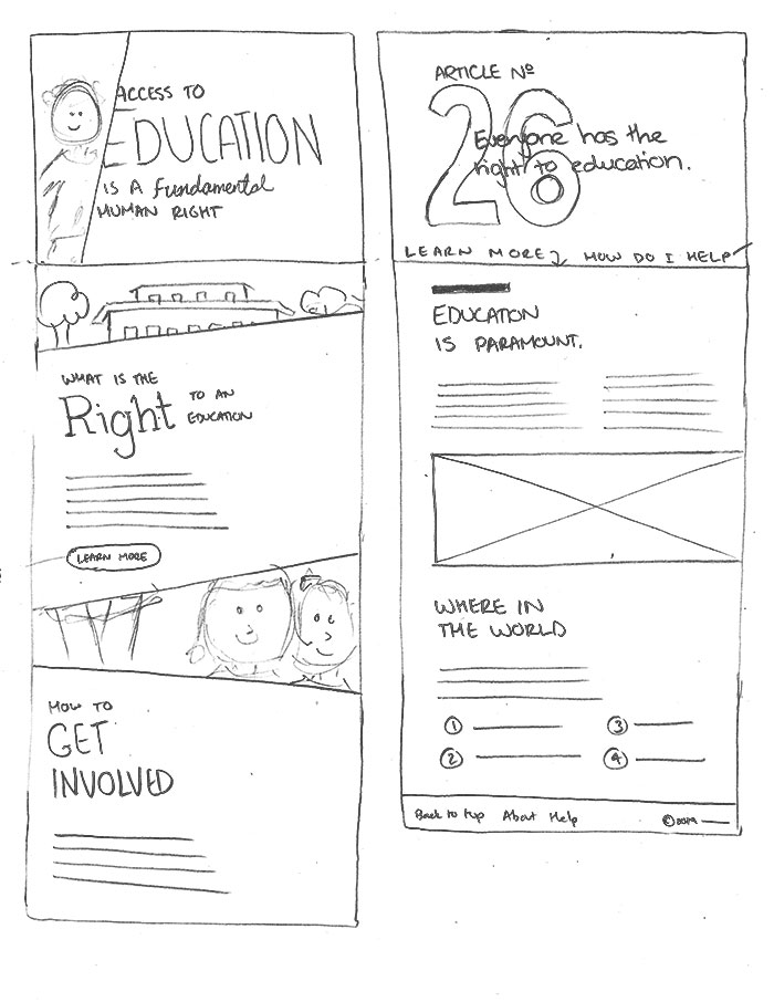
together4tomorrow’s website blends the often serious nature of its content with playful, schoolbook-inspired illustrations and animation.
together4tomorrow doesn’t assume any prior knowledge on the part of the viewer of the Universal Declaration of Human Rights, what’s meant by a right to an education, or how education rights play out in other countries or for other minority groups. Instead, the campaign is designed to help viewers flow through steps towards action.
Give our viewers a high-level overview of Article 26 in a way that’s engaging, friendly, and approachable. Ensure all content is clear and accessible across languages and locations.
Focus on exploring the issues and their solutions together, with clarity, to make big, distant problems—like the right to an education—more approachable and actionable.
Avoid negative language, emphasizing hopefulness and togetherness instead. Guide them in taking small steps to get involved that lead to greater advocacy down the road.
Since the campaign’s first step is to inform, encouraging the audience to visit the together4tomorrow website from the get-go was crucial. Once they were there, they’d be able to learn more about the Universal Declaration of Human Rights, explore the issue in greater depth, and get involved with the campaign.
together4tomorrow’s website made up the bulk of the campaign in this stage (in addition to a style guide), so it was important that the first page our audience encountered really delivered, telling the campaign's story and inspiring action right from the start.
The illustrations for the campaign were designed to be easily recognizable across cultures and age groups, and focus on the positives outcomes of an education, rather than the negatives people experience when they are denied access to it.
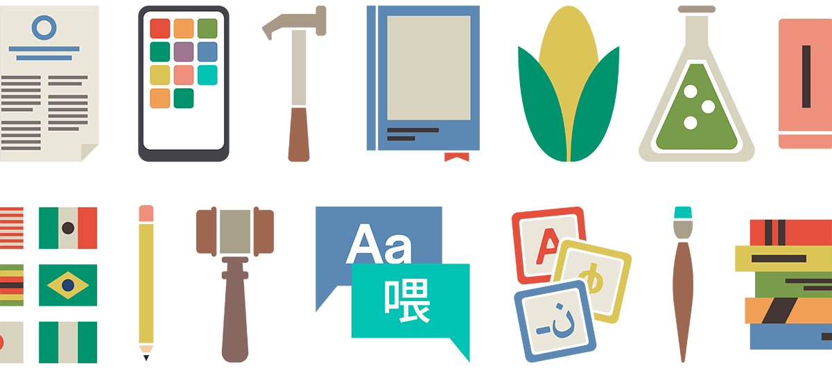
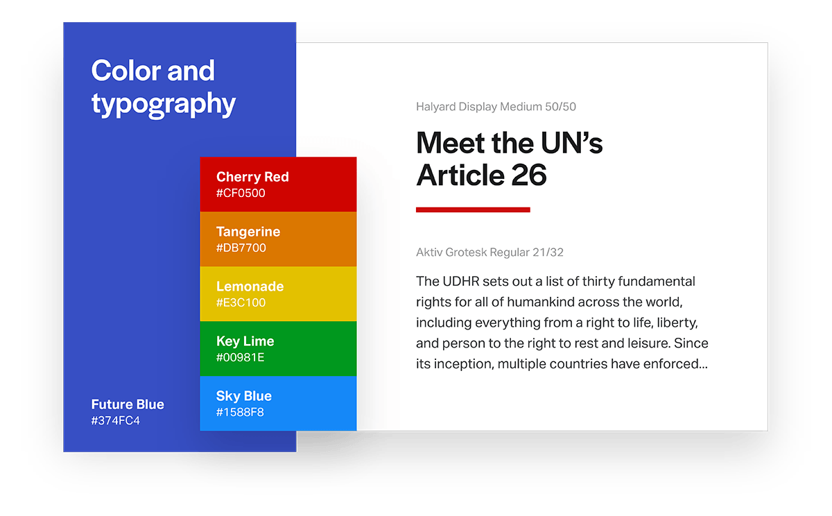
The color palette for the campaign was directly inspired by the many elements of a childhood education—children’s books, a box of crayons, and the creative exploration goes with them.
together4tomorrow’s typography was chosen to maximize legibility and readability, as well as be as inclusive of other languages and levels of ability as possible. It combines Halyard Display for headings and display type and Aktiv Grotesk for body copy.
The final experience consisted of a Campaign Style Guide, a website, and a web animation prototype, each designed to emphasize the opportunity that all of us—no matter who we are or where we’re at in the world—have to demand change that betters education for folks around the globe.
With bright colors, friendly illustrations, and clear, actionable messaging, together4tomorrow makes understanding and advocating for everybody’s right to an education a little more approachable, a little more impactful, and a little more doable.
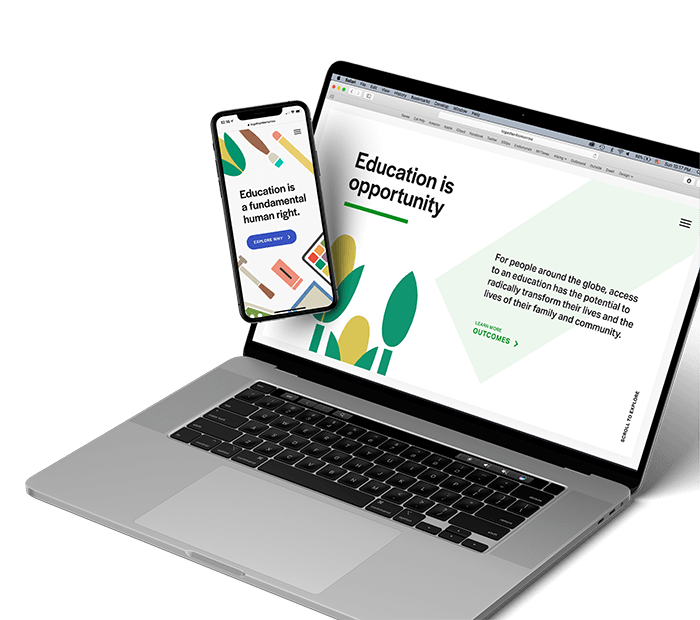
together4tomorrow’s website was designed to be responsive, so it looks great on any size device. And thanks to its use of SVG images only, it’s lightweight and loads quickly, even on slower internet connections.
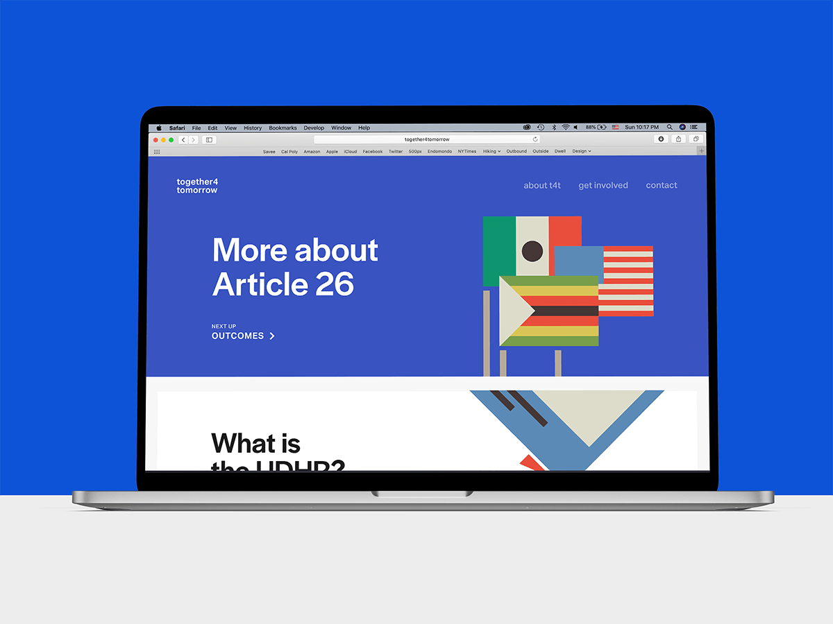
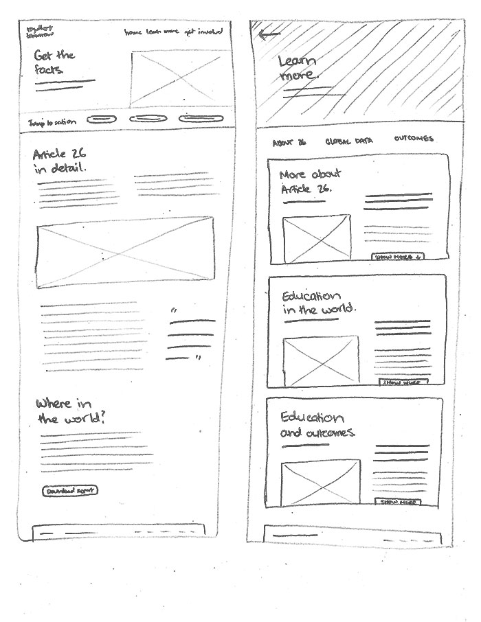
together4tomorrow’s website is made up of four parts, each building on those before it. As users explore, they first learn about the UDHR, then the benefits education provides, then the pieces that make up quality education, and, finally, the reasons education is under threat.
If the site detects a visitor from a location with more than one frequently-used written language—like the United States—a language switcher appears at the bottom of the screen. Once they pick a language, it remembers their choice the next time they come back.
Designing an app that makes tracking winter sports faster, easier, and more useful
Designing an award-winning app that makes taking climate action as easy as checking your phone