Explore the Data
What is this?
As a part of our research process, we found some relevant data visualizations about the population of Tanzania as a whole related to child mortality, available calories per person, and related health metrics. Since these could be useful to others looking to better understand the issues underlying our project—and why we've decided to focus on weaning formula—they're embedded below. These graphics are interactive, so feel free to play around with them. Datasets and visualizations courtesy of Gapminder.
Typical Maasai diet by age
Note: These graphs are not interactive, as they are not from Gapminder. Click on the image to view the original, full-resolution file.
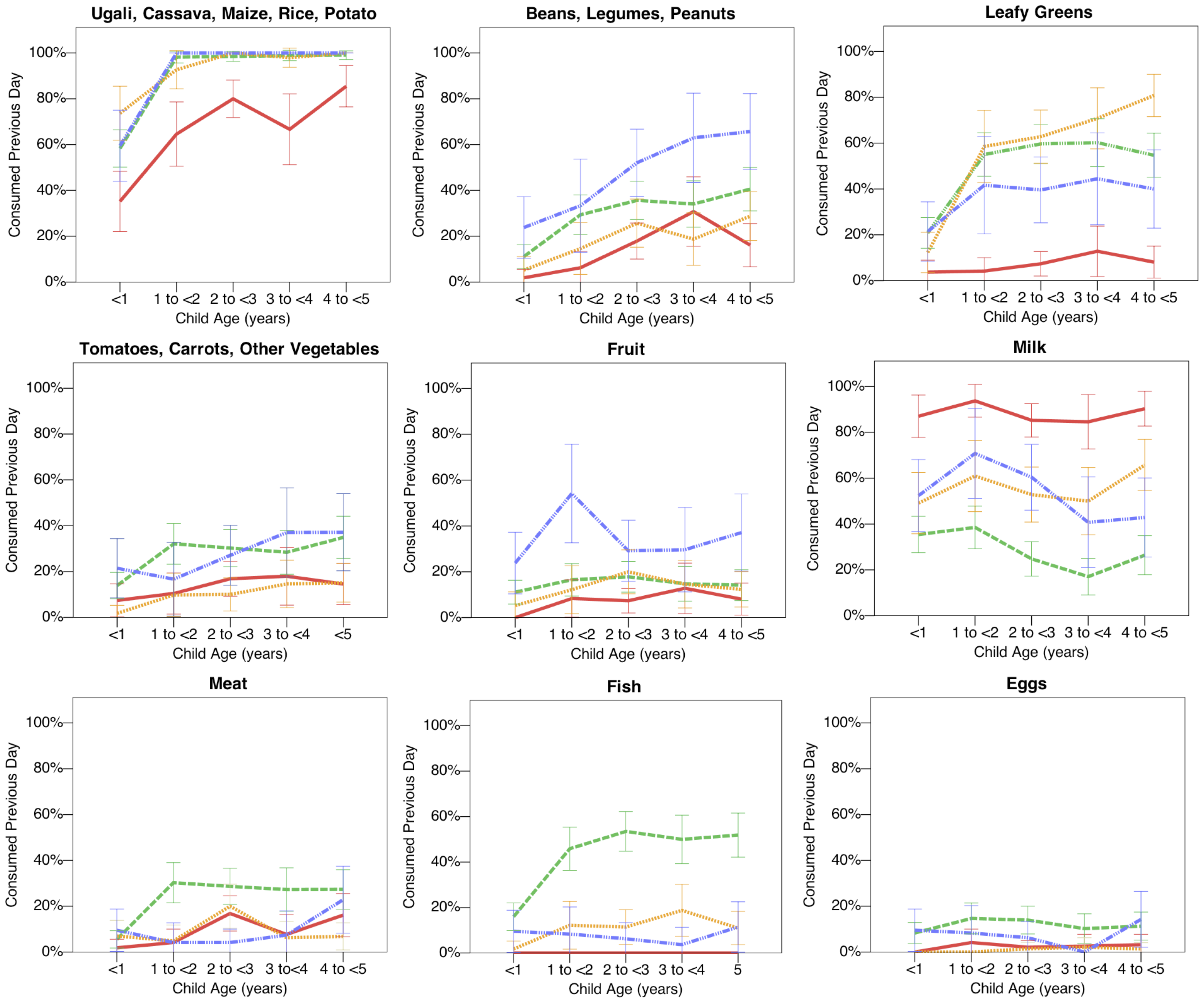
The above graphs have been pulled from the article "Ethnicity and Child Health in Northern Tanzania: Maasai Pastoralists Are Disadvantaged Compared to Neighbouring Ethnic Groups", linked under Further Reading. The red line in each graph represents values reported for Maasai youth; the other lines are for the diet habits of people belonging to neighboring ethnic groups in similar environments.
Child mortality plotted with Child malnutrition
Note: Since this graph is directly embedded via the Gapminder website, we're unable to add labels to the y-axis; its title should be "Child Mortality (0–5 year-olds dying per 1000 born)".
This shows Tanzania's relative position on a graph of Child Mortality vs. Child Malnutrition compared to other countries with available data on Gapminder. If this visualization isn't loading, click here to load it in your browser.
Malnutrition, Global Rankings
This shows Tanzania's relative ranking globally for Child Malnutrition, taking the nineteenth spot for most children malnourished in 2015 (via Gapminder). If this visualization isn't loading, click here to load it in your browser.